The predictive maintenance module of the Kavaken platform consists of four parts, each of which represents different features of the module; Flags, Components, Heatmap, and Features. This short article details the Heatmap page and its features.
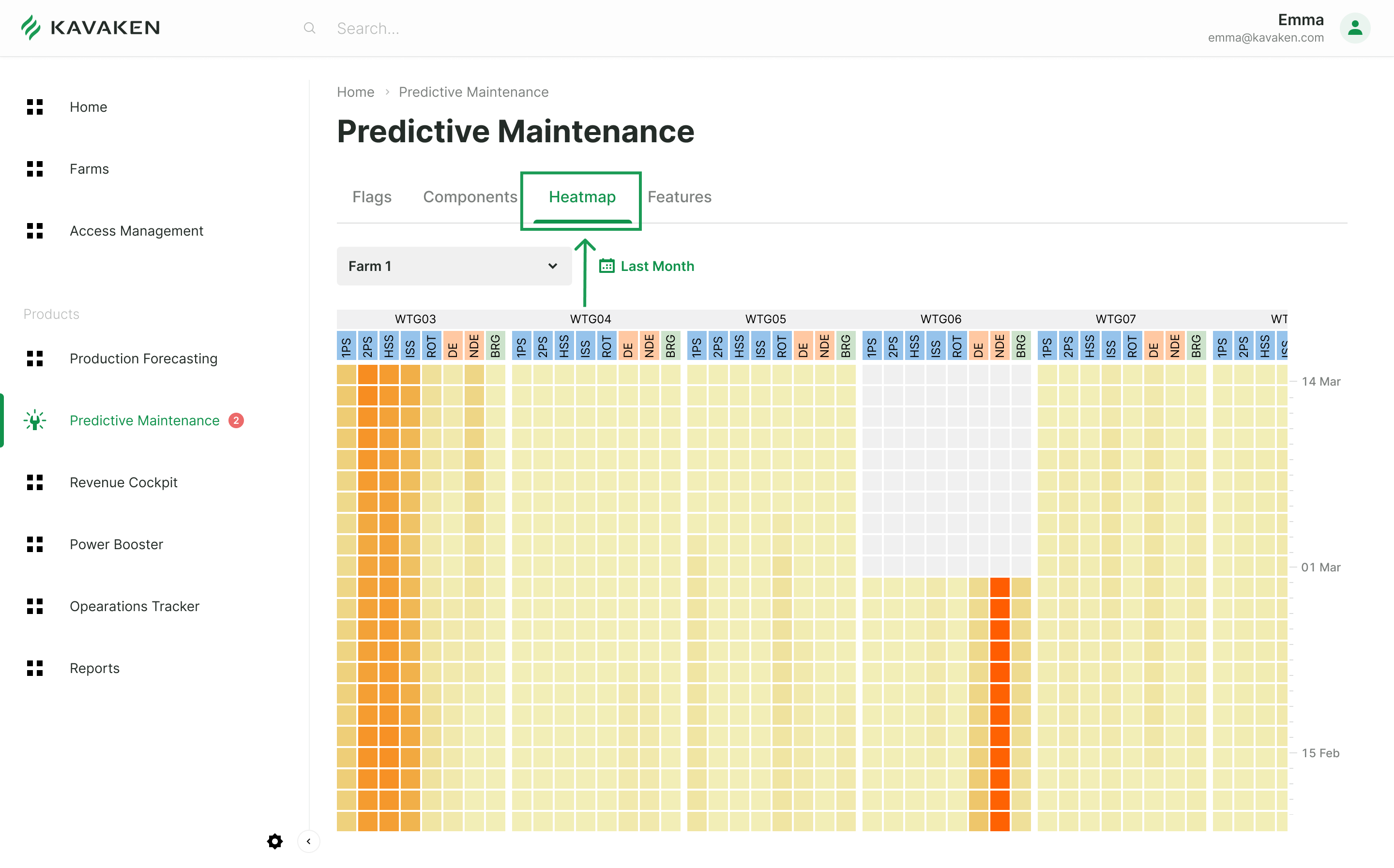
When we click on the Heatmap menu, we are greeted by a map that changes between light yellow and red directly proportional to the fault level. This map is designed to give you the health condition of all turbines on the farm at first glance. Turbines and their subcomponents are placed in the columns, respectively, and you can see the dates going backward in the rows.


The colors of the cells are determined by the output of the ensemble of machine learning algorithms trained to give the condition of the system by using available sensory data (e.g., accelerometers, SCADA sensors).
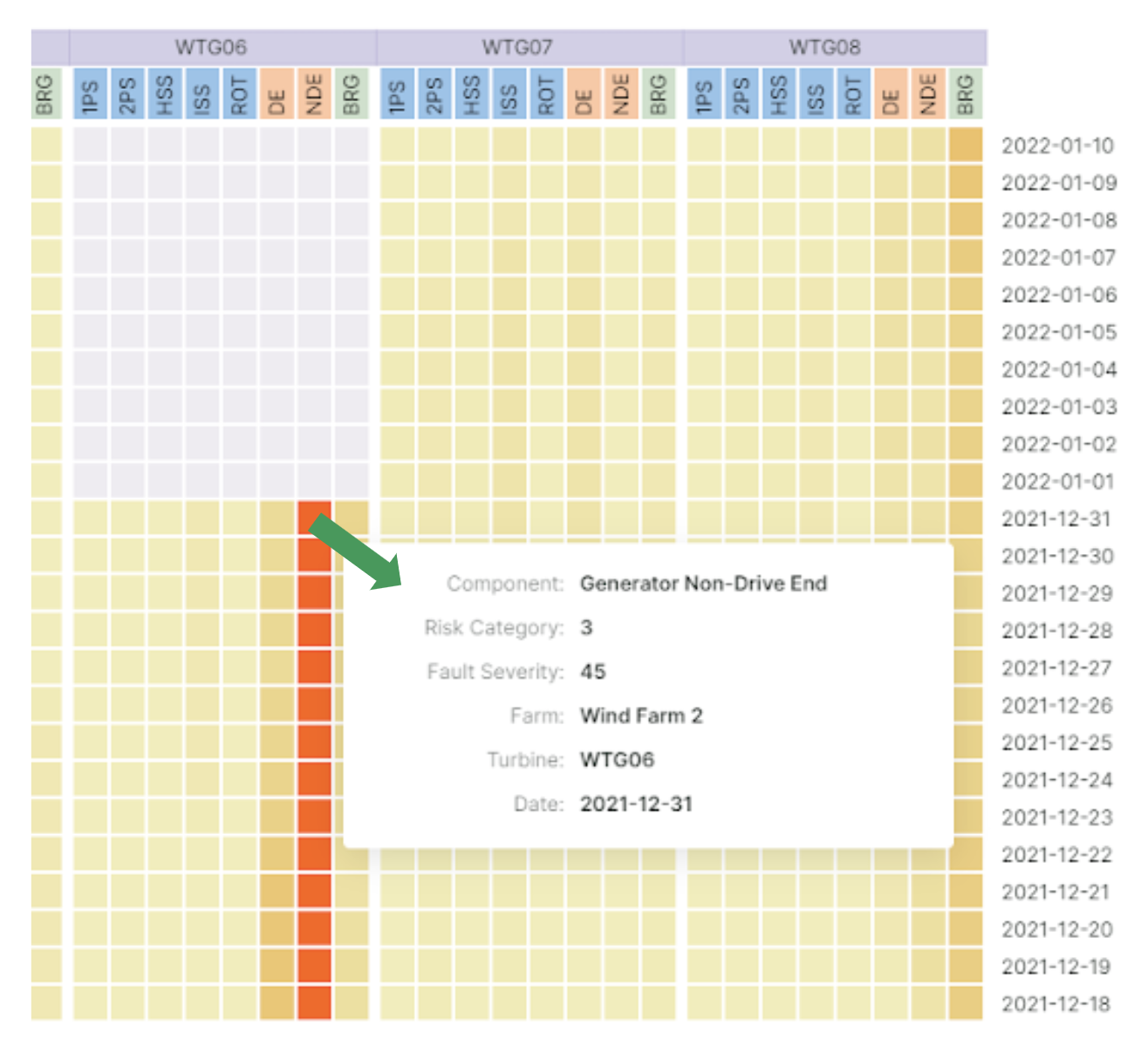
The map shows that the fault level for WTG03 and WTG06 is much more pronounced than the others. We can simply hover over the cell to see the details and determine which part of the equipment these anomalies occur. The map also allows us to check the value of the fault level.
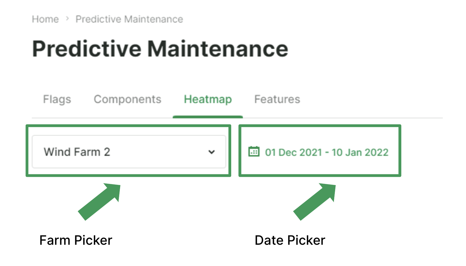
If more than one farm is registered in the system, we can choose the farm we want to view from the drop-down menu on the top left, and if we’re going to make a more retrospective analysis, we can change the date by using the date picker.

The default date range contains the last 30 days. Say we want to see the last three months’ heatmap of the bearing on the non-drive end of the WTG06 generator. After choosing the desired date range via the picker, the heatmap expands downwards and shows the three-month period. When we scroll down, we can observe that the anomaly level increases rapidly as the colors of cells get darker.

To sum up;
- After logging into the platform, registered users can access the Heatmap page and see the performance of all turbines on the farm at a glance.
- For a more detailed analysis, you can display the fault levels between the desired date ranges and the daily changes of the features on the Heatmap and Features pages.
- If a fault flag is raised for a turbine, farm staff receives a notification by e-mail and can then change the flag’s status on the platform according to the determined action plan.


